Sure, painting is easy - but it takes up plenty of time. If you’re going to tape edges, move furniture, and then spending hours with a brush in hand, the last thing you want is to regret your choice. These regret proof paint colors are classic - and neutral - enough to match almost any decor. Meaning, it’ll be awhile before you need to pick up another paint brush! Review these regret proof paint colors.
 Image: shutterstock.com
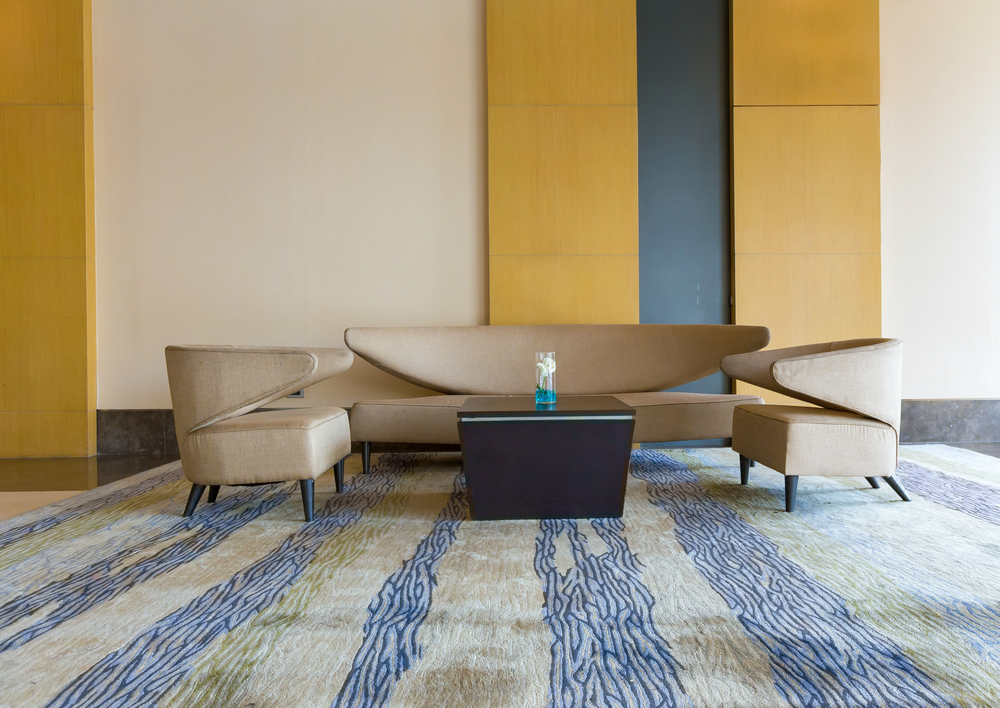
1. Storm (Benjamin Moore)
This classic grey provides the perfect backdrop for high contrast neutrals like black and white, or a nice pop of color! Sleek, modern, and easy to pair with your favorite brights, you’ll be loving this shade for years to come.
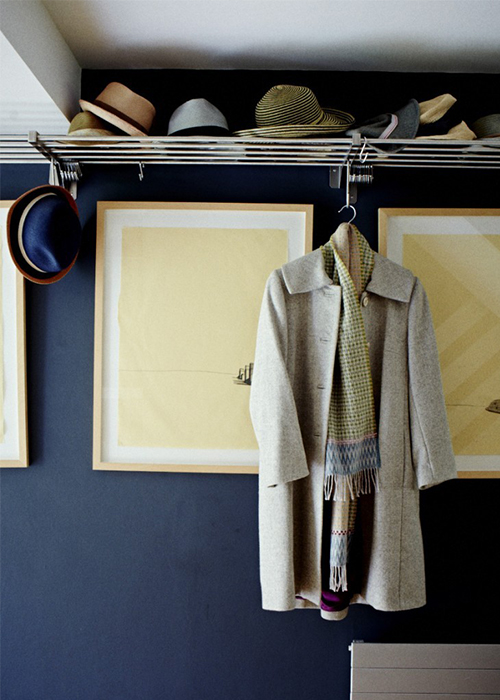 Image: st.houzz.com
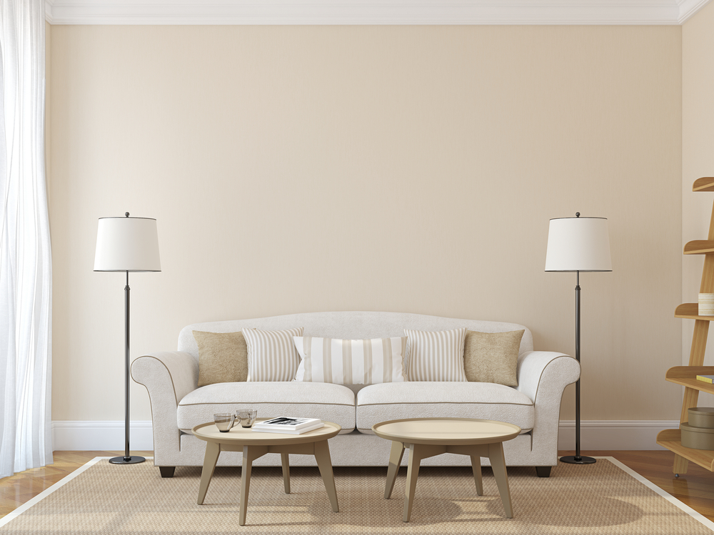
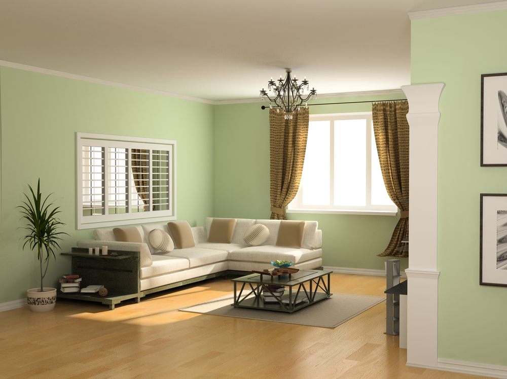
2. Accessible Beige (Sherwin-Williams)
A beachy neutral that exudes calm, Accessible Beige by Sherwin-Williams is definitely a classic color. Neutral and versatile, this easy-to-match hue will fit well into almost any home’s color scheme.
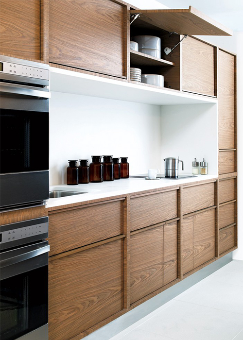 Image: st.houzz.com
3. French Grey (Behr)
This perfectly soft grey is a wonderful shade for any room in the house, as it will match pretty much everything! You can change the furniture and accessories, but you won’t have to repaint the walls if you opt for this beautiful, breezy hue.
 Image: st.houzz.com
4. Sea Salt (Sherwin Williams)
No, it’s not white, grey, or beige, but this beautiful color is still super easy to match. Perfect for lightening up any space, Sea Salt, but Sherwin Williams is a beautiful blue-green shade that plays nicely with neutrals and gorgeous bright hues.
 Image: kylieminteriors.ca
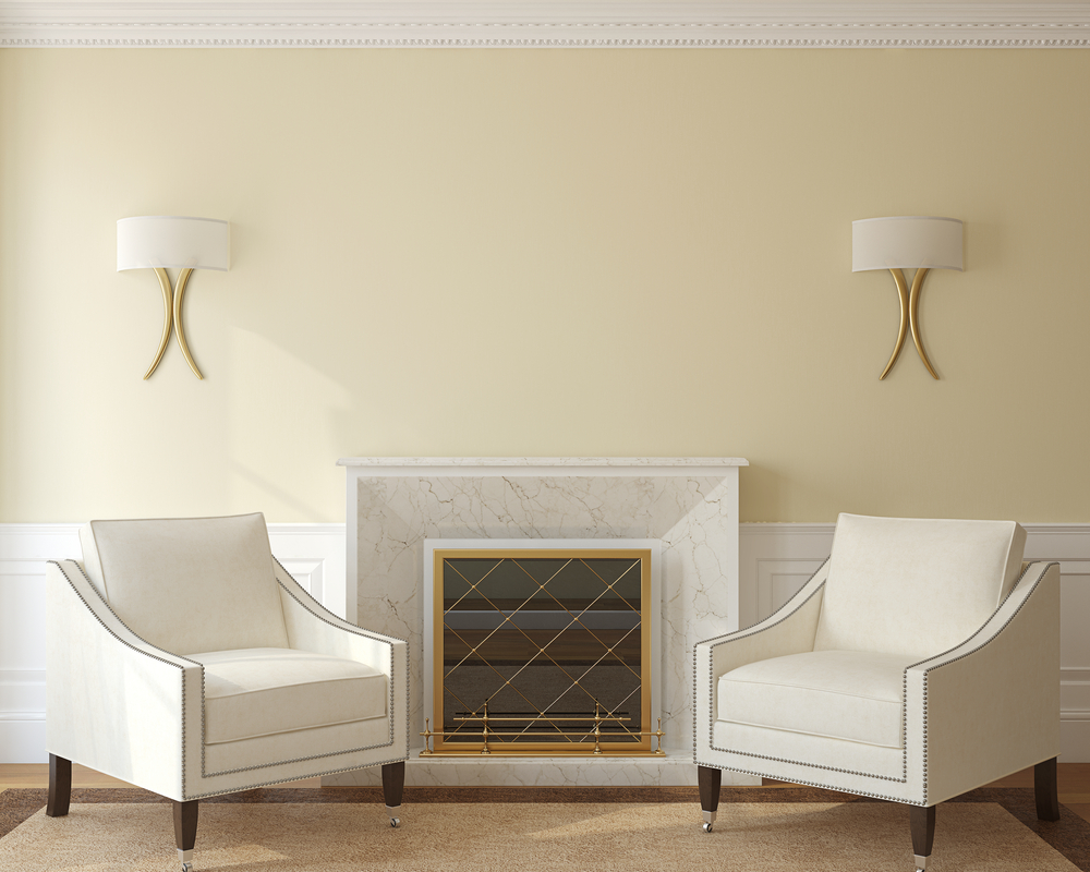
5. Alexandra Beige (Benjamin Moore)
For a beige that’s a little more bold - but still easy to match - we’re loving this Alexandra Beige paint by Benjamin Moore. The neutral color provides a nice warm backdrop that will never go out of style.
 Image: st.houzz.com
6. Lace Handkerchief (Benjamin Moore)
This natural soft cream looks great when paired with other neutrals, or bold brights. It’s a color that you won’t necessarily notice, but that will compliment your furniture pieces well - meaning you shouldn’t have to repaint even if you do get a new couch.
 Image: st.houzz.com
7. Rainwashed (Sherwin-Williams)
The perfect neutral with plenty of personality, this green-grey offers a hint of easy-to-match color without overpowering your decor - plus, it can really brighten up a space.
 Image: kylieminteriors.ca
8. Windsor Pink - Fine Paints of Europe
That delicious blush isn’t just for millennials, you know. After all, this color is reminiscent of stuff you couldn’t even afford in your 20s: think wild, ethically sourced salmon and plump, fuzzy, organic peaches. A new neutral, but a whole lot tastier.
9. Coastal Cottage - Benjamin Moore
In our increasingly fast-paced lives, a calm haven - preferably one by the healing power of the ocean - is high on our wish lists. In the meantime, there’s the soothing effect of this timeless hue, which will add both color AND zen to your space.
10. Black Suede - Behr
So black’s a scary proposition on a wall - yet it’s your default wardrobe choice? Shift your mindset and you’ll see that a shadowy gray-black, like this one, is evocative, rich and flattering, rather than overbearing. Luxe it up with gold accents - just as you would with an outfit.
11. Stony Ground - Farrow & Ball
It’s neutral, Jim - but not as you know it. Earthy and calming, this is a mushroomy hue with a touch of botanical virtue and none of the hallucinogenic vices - although it will blend beautifully with acidic brights or darker, moody tones.
12. Cotton Balls - Benjamin Moore
Enhancing a sense of tranquility, this is not quite gray and not quite white - and yet both, with a hint of delicious cream. This color somehow manages to hold its own, regardless of lighting conditions - and it combines effortlessly with both gentle and bold complements.
13. Crushed Oregano - Valspar
Yes, it’s a whole lot bolder than your average neutral, but suspend your disbelief for a moment. How much energy do house plants add to our interiors - but how successful are most of us at keeping them alive? Bring your botanicals to (a longer) life with nature-lovin’ verdant shade of yellow-green.

14. Elmira White - Benjamin Moore
Playing it safe doesn’t have to mean dull, nor sterile. This creamy white neutral has a glowy beige undertone which adds warmth without adding color, and which enhances a sense of light that has depth. The result? An inviting, welcoming space you’ll want to live with for years.
15. Ethereal Mood - Sherwin Williams
You could be a beige lover or a gray lover: prepare to be seduced either way with this not-quite-one-nor-the-other neutral. If this shade was a potential romantic interest, its chameleon-like qualities might set your alarm bells ringing, but ooh, how we love it in a wall color!
16. Peignoir - Farrow & Ball
Doesn’t the name just say it all? Muted and intimate, this is a sexy, dusky pink: think neutral with a dusting of blusher, or a just-woke-up rosy glow. Feminine, but not just for women - after all, men love lingerie just as much, right?

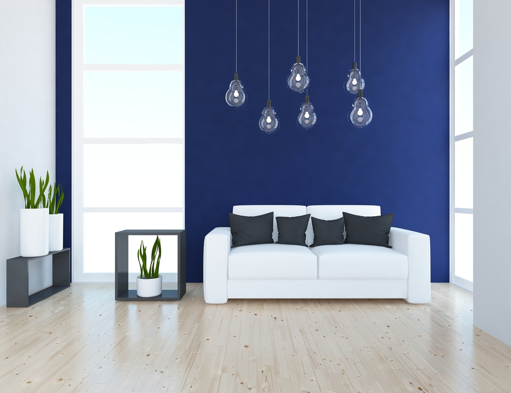
17. Byzantine Blue - Glidden
It’s calm and cool, with that luxurious jewel-like element that we love in a blue - yet this shade is the Pretty Woman of the palette - sassily asking, “What do you want it to be…?” - looking grayer when you combine it with dark neutrals, while whites bring out its shifting-sea blue-purple hues.

18. Elephant’s Breath - Farrow & Ball
Working beautifully in both larger and smaller spaces, this harmonious shade lends cool sophistication and elegance to a room. This gray-beige - ‘greige’ - color adds bags more depth than a white, without compromising on neutrality.
19. Teresa’s Green - Farrow & Ball
Think freshness and ambience: this grown-up pastel won’t leave you feeling like you’re in a baby’s room or a candy store. A soft green with gray nuances, you won't tire of this color in a hurry - nor of its warming, soothing effect on your home.
20. Ancestral - Pratt & Lambert
White with a hint of peach creates a beautiful backdrop for stronger colours, whilst ensuring that your ‘blank canvas’ retains loads of its own personality. Light-reflecting and space-enhancing, this is a shade that works with any decor, whether traditional, modern, bold or subdued.
21. Thundering Clouds - Valspar
It’s Blue Steel - but banish all thoughts of Zoolander, because this color has way more longevity than the fleeting star of a fashion model. Marrying the cool industrial detachment of a gray to the calming mindfulness of a blue, you’ll want to live with this shade for years to come.
22. Revere Pewter - Benjamin Moore
Whether your style is sleek and contemporary or rich and traditional,this no-fail neutral is not only a ‘go-to’ but also a ‘go the distance’. If your sensible head says ‘white’ but your lusting heart says ‘BORING!’, then this is your shade: it bathes, rather than drenches, your room with color.
23. Oval Room Blue - Farrow & Ball
Soothing and yet dramatic, this stately blue incorporates a generous wash of gray which allows it to blend fluently both with neutrals and strong pops of color. If depth and purpose are key to your interior plans, this is the shade to draw it all together.
24. Flashpoint - Behr
Suffusing any space with light and warmth, this color is braver than beige, incorporating a sunny gleam of pastel yellow that will harmonise seamlessly with bolder shades. Sophisticated and welcoming, this is a timeless and mood lifting choice.
25. Poised Taupe - Sherwin Williams
A gray/ brown hybrid, this shade has more warmth and complexity than a classic gray. Natural, woodsy elements infuse the color, bringing the outdoors in - and resulting in a therapeutic, calming and restful space you’ll want to inhabit forever.
26. Pale Powder - Farrow & Ball
Sophisticated and elegant, this duck egg shade has a low-key opulence which is enhanced by pairing it with bold, luxe hues. It’s dreamy and soft, with a sunny, verdant undertone that warms up an otherwise neutral decor.
27. Manchester Tan - Benjamin Moore
Think about how perfect stained glass looks surrounded by the weathered stone of a church - and then take this sandstone-inspired hue and use it as a blank canvas on which you can go crazy with color. Warm and welcoming, this shade totally epitomizes ‘fail-safe neutral’.
28. Pearly Cotton - Joanna Gaines
This washed-out beige has enough warmth to draw you in and create an inviting, cozy living space, but it’s light and airy enough to exude a sense of space and ease. Unobtrusive and effortless, this timeless shade sets the scene for a mix of other colors and textures.
29. Crisp Candlelight - Olympic
It’s no secret that candlelight is wonderfully flattering, so why wouldn’t you harness its hue in your home? Part of the ‘yellows’ palette, this color washes your interior in pale sunshine, enlivening your mood, your surroundings and - how’s this for an undeniable win?! - your skin tone.
30. Whisper - Dunn Edwards
A tinge of apricot lends warmth to this white and makes it an ideal base from which to build tone on tone layers of color and texture. This is an investment shade - with its calming, relaxing qualities, you’ll love it forever, no matter how many times you switch up your accents.