Transform the look of your dining room into an incredibly stylish space using the power of color. From a bold bright shade of red to a cool aqua hue, here are the most spectacular colors for your dining room.
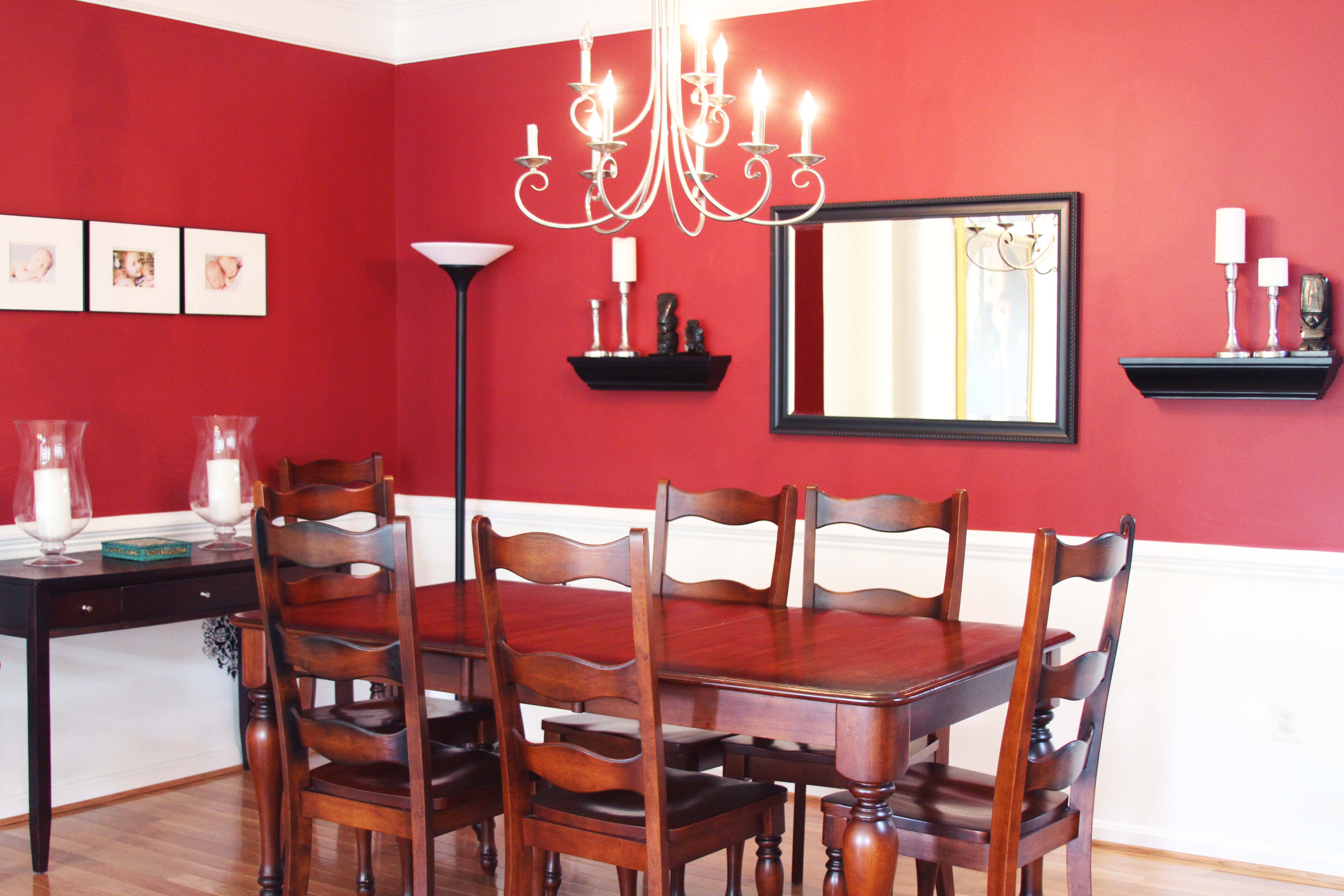
Bright Red
Move away from ‘safe colors’ like beige or white and take a risk by painting your walls red. This beautifully bold shade is perfect for making a dramatic statement and will instantly add warmth to the room. Admittedly this rich hue is not for everyone, but if you’re worried about your room becoming overwhelmed by color - fear not! You could easily reduce the red by painting the bottom part of the wall white. This way you still have a warm and inviting room without it being too overpowering.
 Source
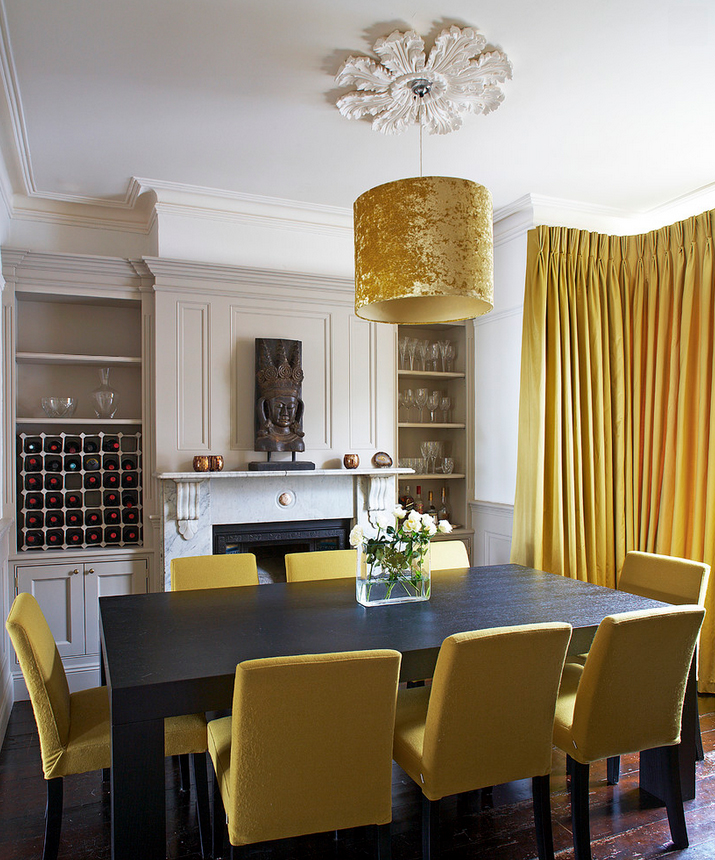
Mustard Yellow
Inject a summer vibe into your dining room with the delectably spicy hue of mustard. Unlike bright yellow, the soft brown undertones of mustard, help make this wonderfully vibrant shade a lot easier to pull off in a home. However we’re not suggesting grabbing a paint brush and covering the entire walls in it. Mustard is a rather intense hue, so it’s best to display it in small doses - unless you really love this color! Warm shades like this are perfect for stimulating your appetite, so add it to your chairs to create an inviting atmosphere during meal times. Place additional mustard accents throughout the room to pull the look together. One great example is a bold lighting fixture - not only does it compliment the chairs, but it creates a warm soft glow in the room too.
 Source
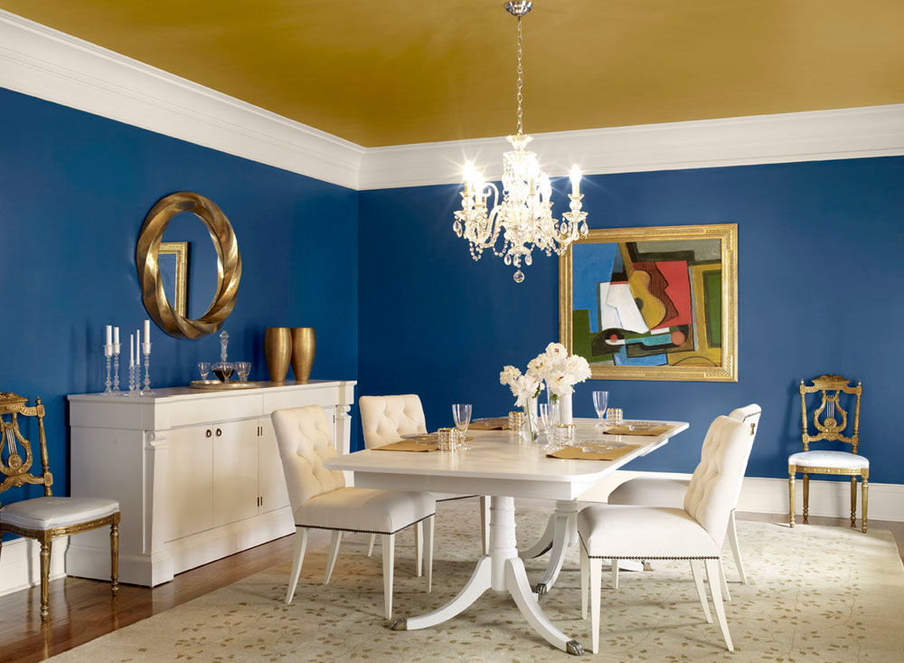
Electric Blue
Dazzle your eyes with an electrifying shade of blue! Unlike mustard yellow, this incredibly stunning hue looks beautiful on all four walls - without bordering on overkill. The dramatic blue shade immediately draws the eye and makes whatever is placed in front of it stand out. Light colored furniture will make the biggest impact in the room - we say the lighter, the better. However if you have little ones running around, white might be an ambitious color. To finish off the look, introduce gold accents such as a gold framed mirror or piece of artwork. These will give your dining room an elegant and expensive appearance - even if they’re not made of real gold.
Source
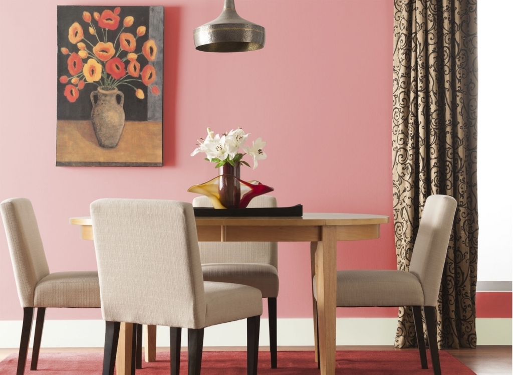
Rose
Introduce pink into your dining room without it looking like you accidentally spilled Pepto-Bismol everywhere. The incredibly romantic rose shade is a great example of chic pink for adults. With its breezy soft hue it can effortlessly transform your dining room into a sea of elegance - without looking childlike. If you’re daring enough, paint all of your walls in this light, calming shade. Unlike deeper and more vibrant hues of pink, rose is less obtrusive, so it shouldn’t be too overwhelming in your dining room.
 Source
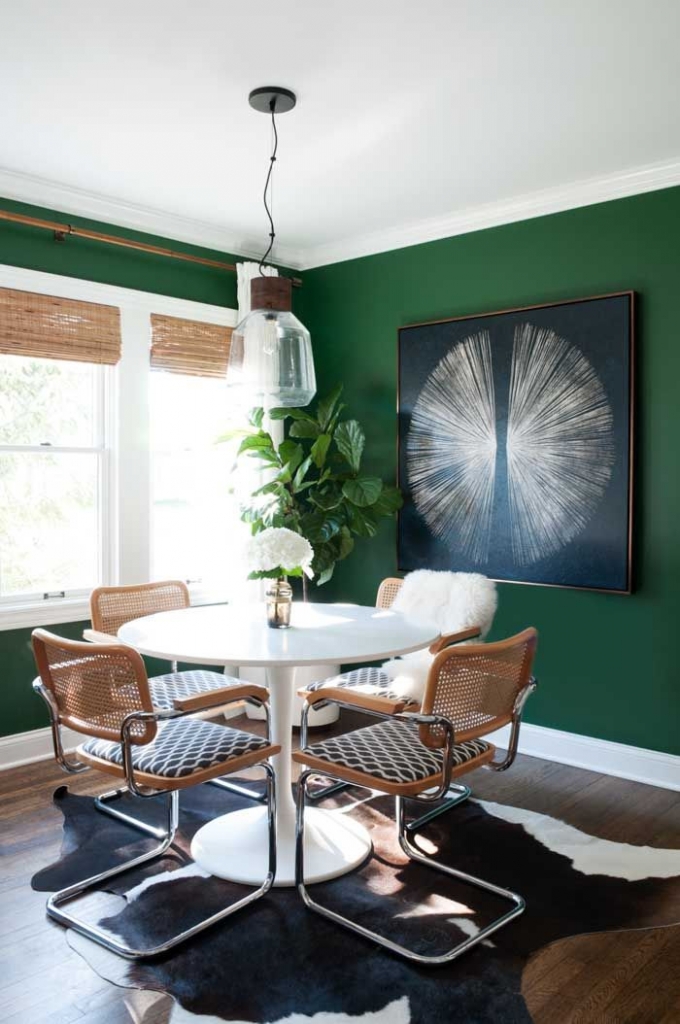
Deep Green
There’s nothing more relaxing than a stroll through a lush forest, so bring some of that outdoor vibe indoors, with a deep, earthy shade of green. This serene color is hailed for its soothing properties - so it should come in handy during those stressful mealtimes. Surround yourself with this relaxing color by painting it on each wall of your dining room. If you want to give your room a more rustic look, add a wooden table and chairs in a deep hue to truly embrace the outdoors.
 Source
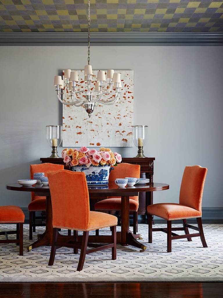
Orange
Bring some zest into your dining room with a warm and highly energetic shade of orange. Often dubbed a risky color, you may be surprised to learn orange is a popular choice in dining rooms. The secret is, you just need to pick the right shade and apply it in the right places. Although your walls may be the first choice when it comes to applying orange, this might not be the best option. Muted hues work best on the walls, but anything brighter and you’re likely to end up with an eyesore. Prevent offending your eyes by sticking to simple orange accents. Keep the walls a simple neutral color, and apply a deep red-orange to a limited amount of furniture and accessories. Try restricting it to just the chairs to liven up the space and create a stunning focal point.
 Source
Purple
Take a bolder approach to your dining room color palette with an enchanting shade of purple. Originally a color more often found in your bedroom, it’s now making its way round the rest of the home - and for good reason. Oozing elegance and regalness, this striking hue makes a wonderful backdrop - especially for light colored furniture. If you’re unsure about fully committing to this energetic shade, try out a few small purple accents first. From dining chairs to drapes, little pops of color will easily make a strong visual impact without looking too intense.
 Source
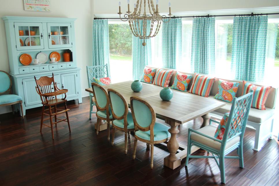
Aqua
Bring a cheery beachy vibe to your dining room by filling it with the beautiful shade of aqua. This alluring hue is incredibly versatile and works well with practically any style and color. Paint your walls a simple, neutral shade and furnish the area with bright aqua pieces to create a compelling contrast. Combine this idyllic shade with radiant hues such as orange and white, and you’ll feel like the beach is right in your dining room. Alternatively, mix in earthy tones such as light brown to create a more vintage feel.
 Source
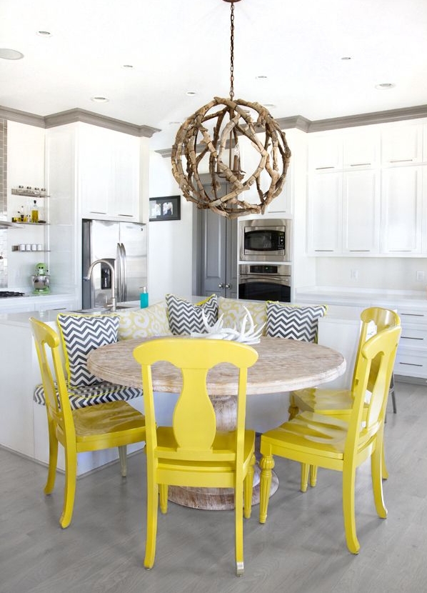
Bright Yellow
Although we said mustard yellow is easier to pull off than a brighter shade, that doesn’t mean you should completely disregard it. When used right, bright yellow can enliven plain, dull dining rooms and create a warm, cheerful atmosphere. Relax in the golden allure of summer all year round with striking yellow dining chairs. You can take it a step further by painting one of your walls in this stunning hue - but avoid plastering them all in yellow paint. If you surround yourself with too much yellow, this is believed to cause anxiety and lead to a temper - which is obviously not what we want to achieve.
 Source
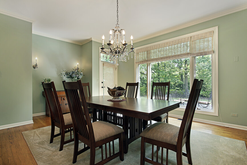
Mint Green
Refresh your dining room with the cool, crisp shade of minty green. With its subtle colorful tinge, it’s the perfect introduction to trying out new paint colors - without risking a gaudy bright mess. This uplifting light hue looks beautiful on the walls and on the furniture too. Combine it with neutral shades to create a calm, relaxed atmosphere - an ideal setting for when you want to unwind after a stressful day at work.
 Source